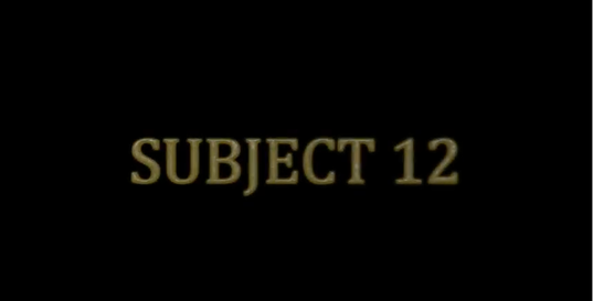
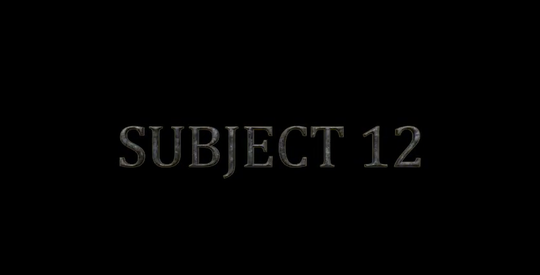
Title of the film
Other titles in the OTS

Conclusion
The titles that we have chosen to use in our opening title sequence are very basic, plain and simple. These would be the type of fonts which audiences would link with safety as white, silver and gold are not colours that symbolise death or danger. This adds to the effect of the OTS because it creates a bit of tension due to the titles contradicting the opening title sequence.
Other Film's titles
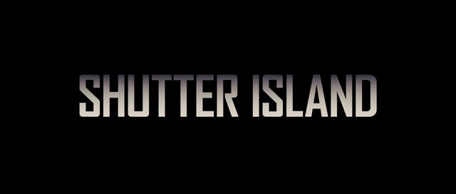
Shutter Island
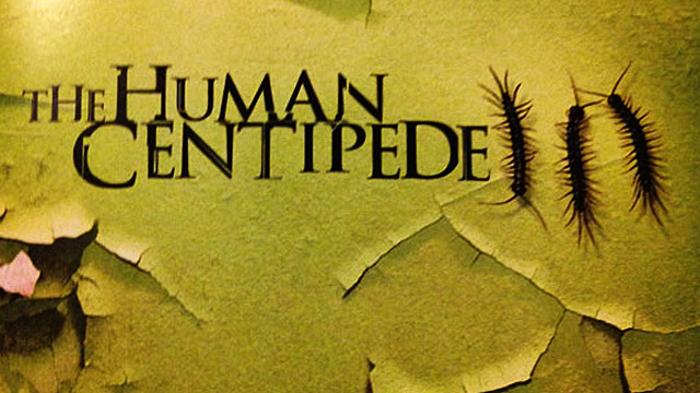
Human Centipede